Home
Bootcamp Project
Duration: 2 Months
Figma
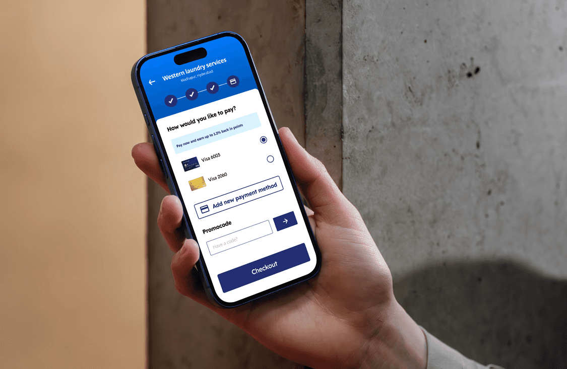
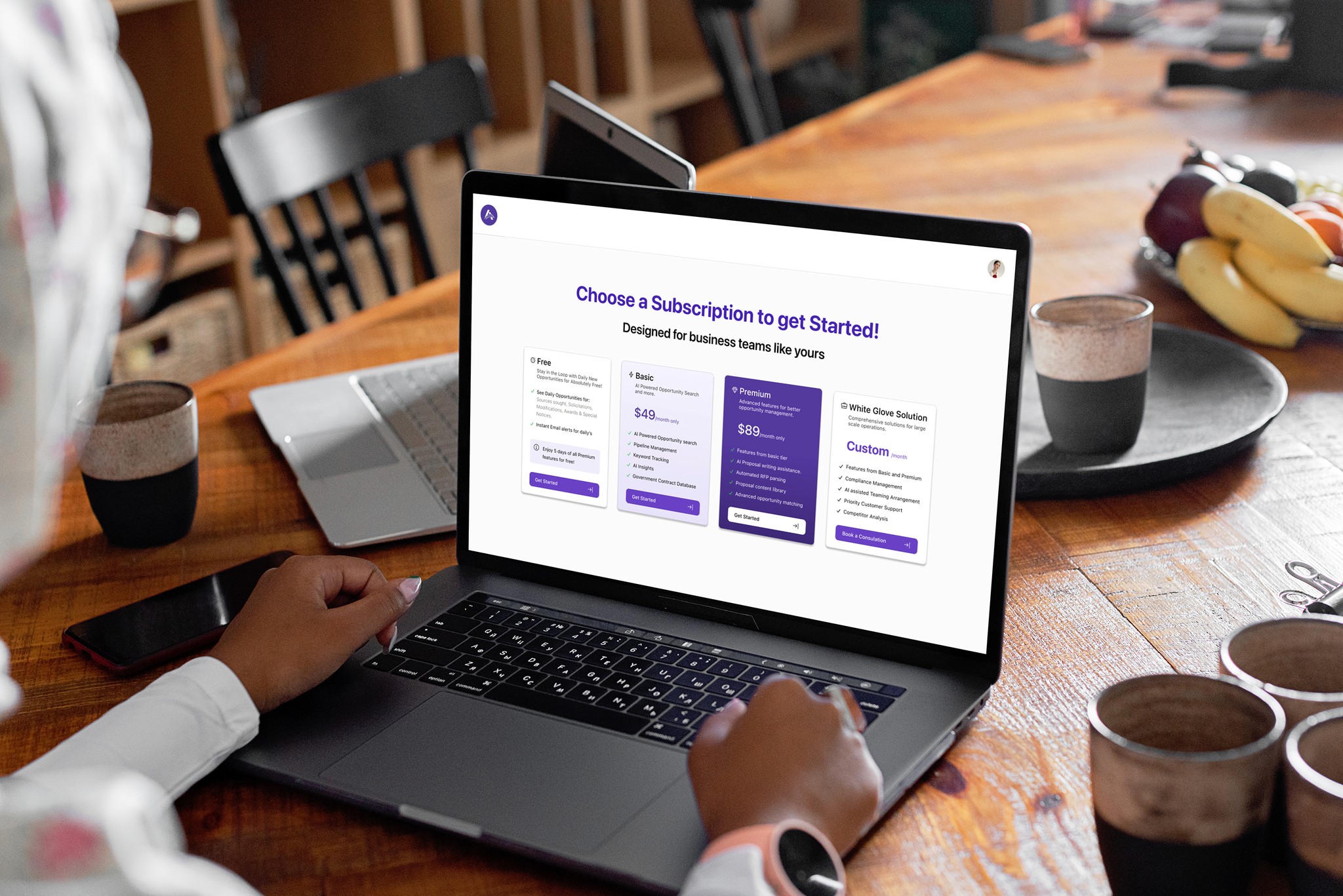
AugierAI.com is a comprehensive AI-powered platform that supports small to mid-sized businesses throughout the entire procurement lifecycle, from identifying opportunities to teaming and project management. I joined this startup project as a UX Design Intern during the final semester of my Master's program. Working in a fast-paced environment during the platform's initial development phase provided me with valuable learning experiences. I contributed significantly to the project's success by designing user-centered and business oriented solutions to streamline workflows. I am sharing a small portion of the project I worked on, which is now live, in this case study.
Introduction
Project Overview
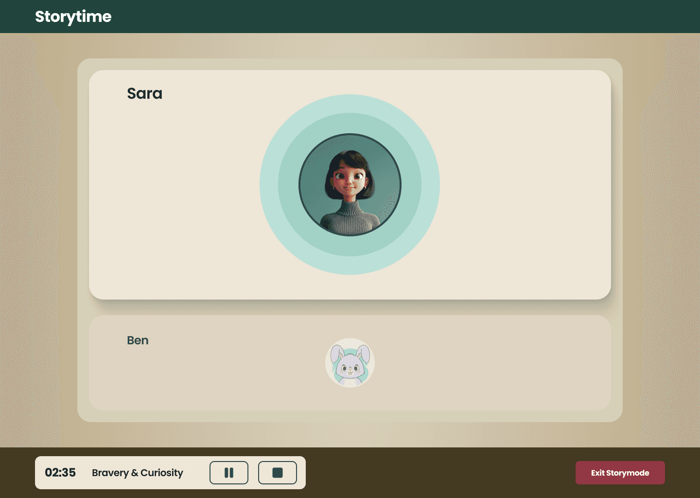
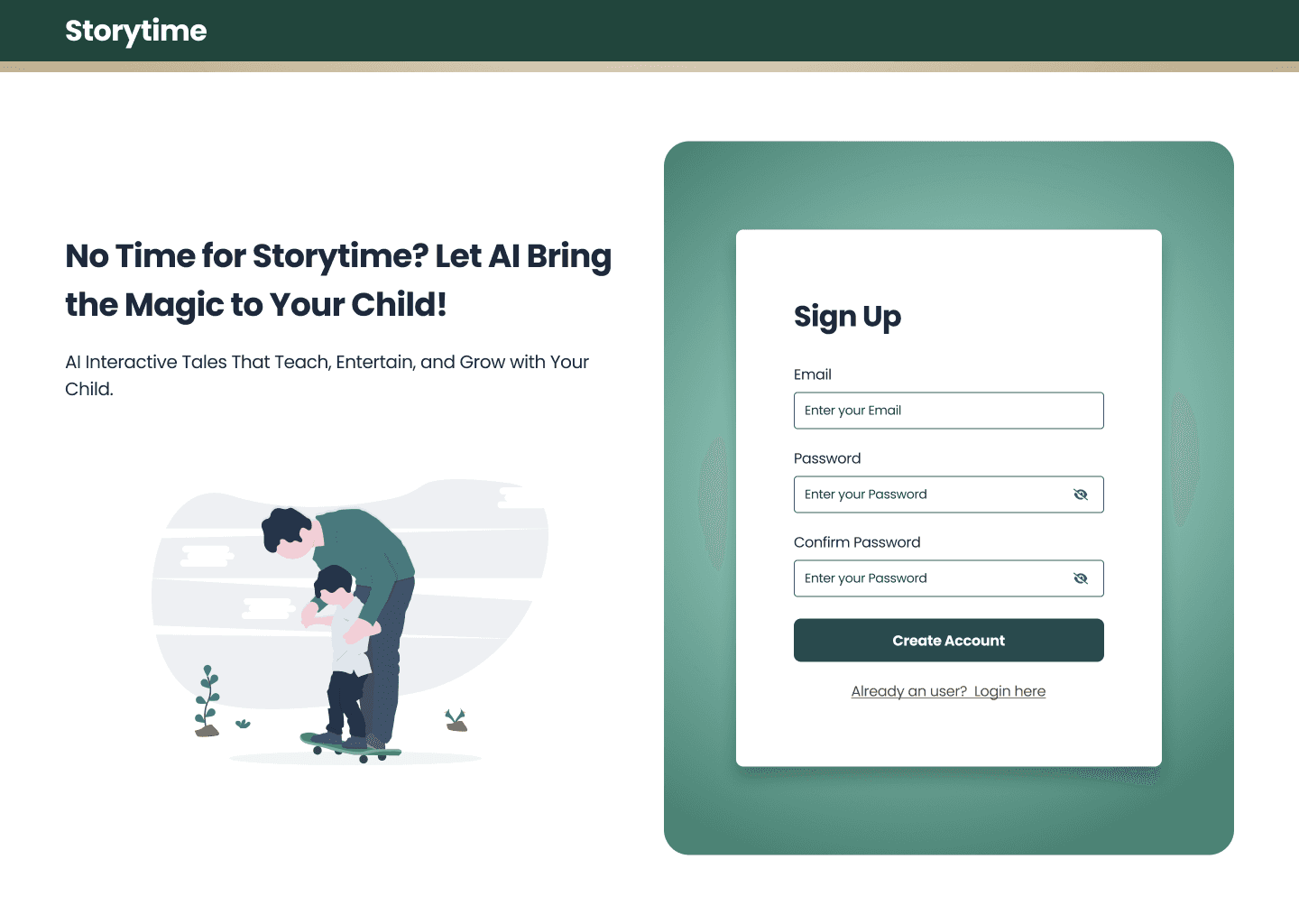
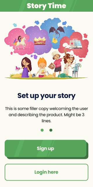
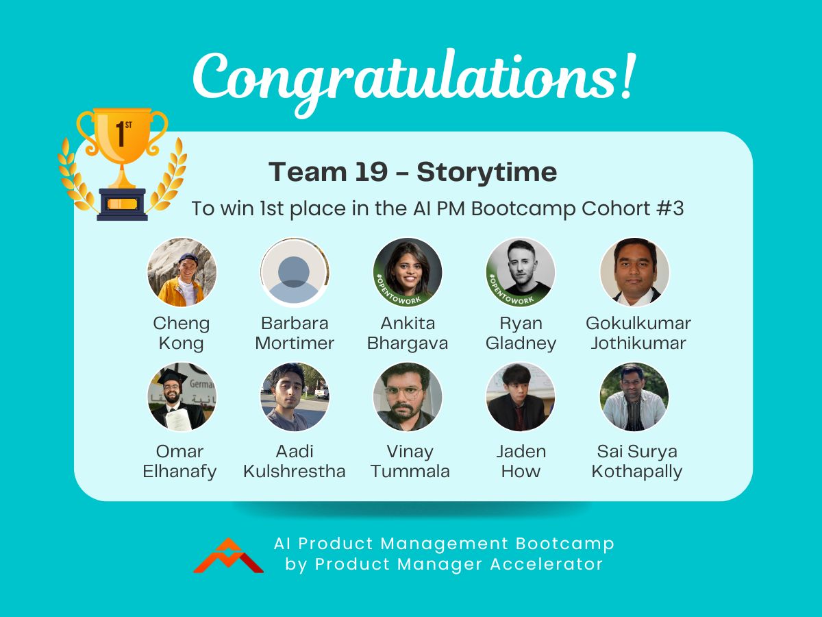
Storytime was a Bootcamp project developed as part of Dr. Nancy Li’s Product Manager Accelerator Program. I joined Cohort #3 as an AI UX Design Intern, where I was team-matched with Team Storytime, one of 9 teams in the cohort.
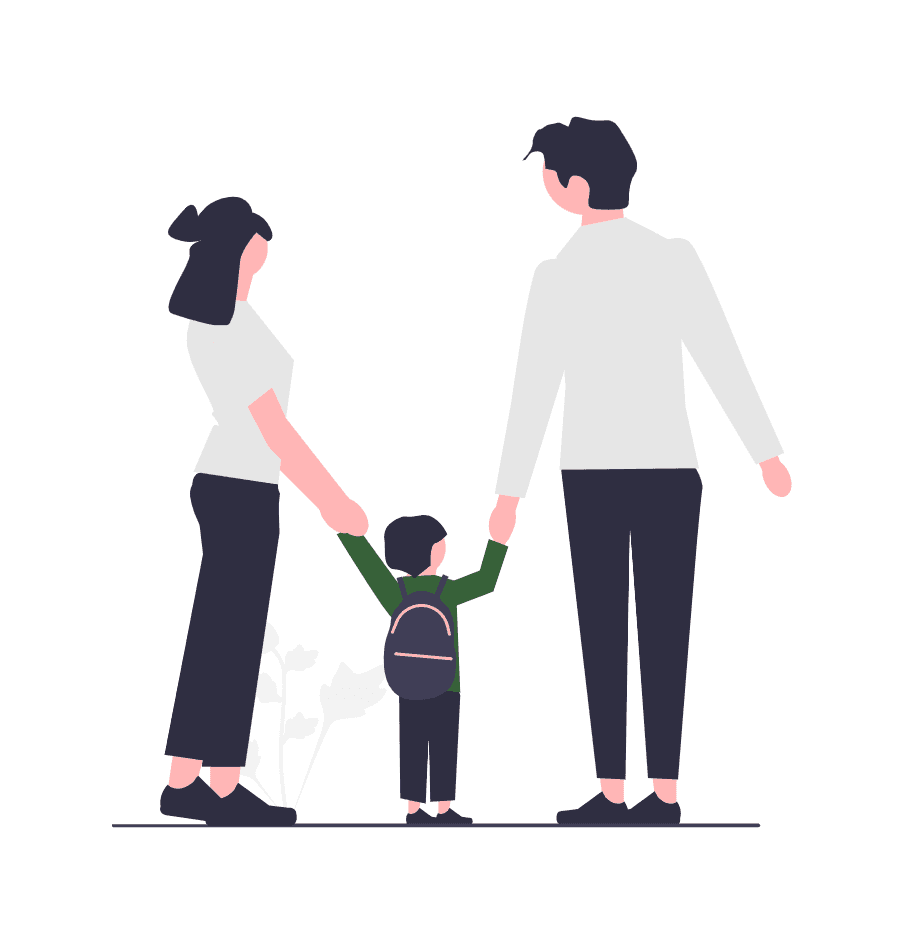
The product we worked on was an AI-powered, voice-activated communication tool for children. Designed to be both educational and engaging, the app leverages multiple AI models to deliver dynamic, conversational storytelling experiences. It helps children learn and practice communication skills in real time by generating interactive stories tailored to topics and educational goals selected by both parents and children, keeping young minds entertained, engaged, and stimulated.
Problem Statement
Every parent wants to give their child the attention, interaction, and mental stimulation they need to grow and thrive. But let’s be real—life gets busy. Between work, chores, and everything else, it’s not always possible to be fully present all the time. To fill the gap, many parents turn to screens or toys. While convenient, these often offer passive stimulation, which can lead kids to rely more on visual input and miss out on deeper, more meaningful learning experiences.
Goal & Objectives
During MVP Phase:
Provide an engaging, interactive storytelling experience using various AI models
Ensure age-appropriate, child-friendly voice interactions and responses.
Personalize stories based on user preferences.
Post MVP Phase:
Support multilingual storytelling to help children connect with different languages and cultures.
Implement language progress model/method; language model would adapt to the progress based on the science of language progress.
AugierAI.com is a comprehensive AI-powered platform that supports small to mid-sized businesses throughout the entire procurement lifecycle, from identifying opportunities to teaming and project management. I joined this startup project as a UX Design Intern during the final semester of my Master's program. Working in a fast-paced environment during the platform's initial development phase provided me with valuable learning experiences. I contributed significantly to the project's success by designing user-centered and business oriented solutions to streamline workflows. I am sharing a small portion of the project I worked on, which is now live, in this case study.
Introduction
Target Audience
Busy parents seeking quality, interactive entertainment for their children.
Single parents who need a hands-free activity for their kids.
Kids aged 2-10 who enjoy interactive stories.
Multilingual families looking to immerse their children in different languages.
Parents in multi-children households, where each child has unique storytelling needs.
Parents focused on early childhood cognitive and communication development.
Key Benefits
Engaging & Interactive: Kids actively shape stories by responding to voice prompts.
Personalized Experience: AI remembers past choices to create more meaningful stories.
Voice-activated: reduce screen time
Safe & Age-Appropriate: AI-generated content filtered for child-friendly language
User Journey
Onboarding:
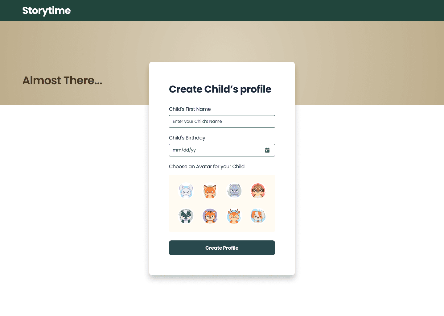
Provide basic information about the Child, including name, age.
Story selection:
Educational Goal, the theme of the story.
Parents set story duration.
Story Interaction:
AI narrates the story, prompting the child to make voice-based choices at key moments.
Feedback
Summarization of the story outcome.
Evaluation of the child’s speech level and feedback to the parents
Design Journey
Design system setup
After gaining a clear understanding of the product we aimed to build, I began setting up the design system to ensure visual and functional consistency. I started with defining the color palette and typography, and progressively built reusable components as I designed each screen based on the requirements.
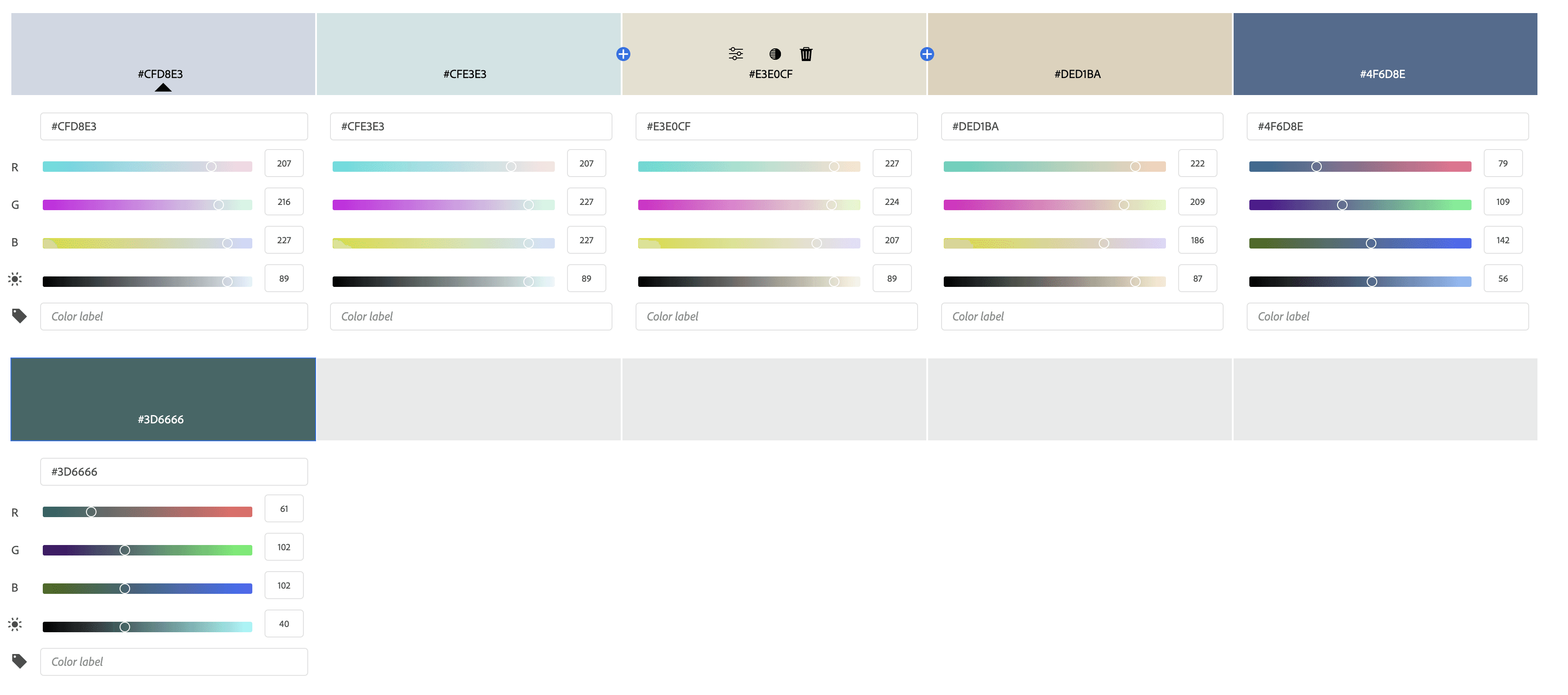
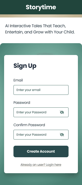
Color palette
I chose bright colors because they felt playful and engaging, and I believed they would be especially appealing to children.
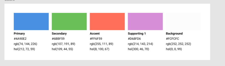
The PM didn’t align with my initial color choices, as he preferred a lighter tone—since the app will primarily be used by parents during the story setup phase. That made sense, so I created a new color palette that better fits his vision.
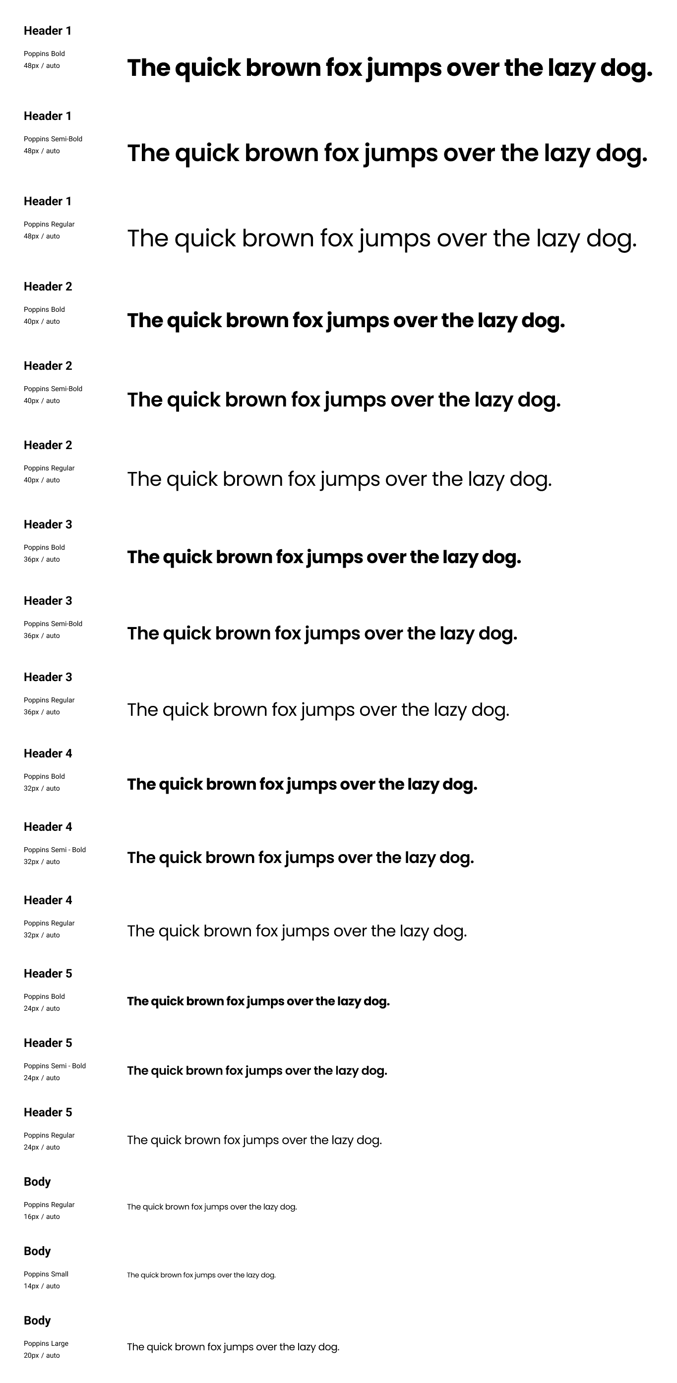
Typography
For the Storytime app, I chose Poppins as the primary typeface due to its clean, rounded, and friendly appearance, which makes it highly suitable for a child-friendly interface. Its geometric sans-serif style ensures excellent legibility, even at smaller sizes—important for young readers who are just learning to recognize and read letters.
Requirements gathered for each sprint
The Product Manager conducted Voice of Customer (VoC) interviews to gather key requirements. Based on the insights, user stories were created and assigned to team members in each sprint, following our Agile methodology. The initial understanding was to create designs for desktop and mobile.
While working on the onboarding screens for the sprint, I noticed that one of the user stories specified that, after signing up, users should be redirected to the login page. I suggested to the Product Manager that this added unnecessary friction and that it would be a smoother experience to take users directly into the application after sign-up. The PM agreed with the recommendation and updated the acceptance criteria accordingly.
Fixing inconsistency in the requirement
I noticed an inconsistency in the user flow, while the password reset process required both a username and email, the signup flow only collected an email. I flagged this to the team, and after discussing it, we aligned on simplifying the experience by removing the username requirement from the password reset process to maintain consistency.

Being mindful of the inclusiveness
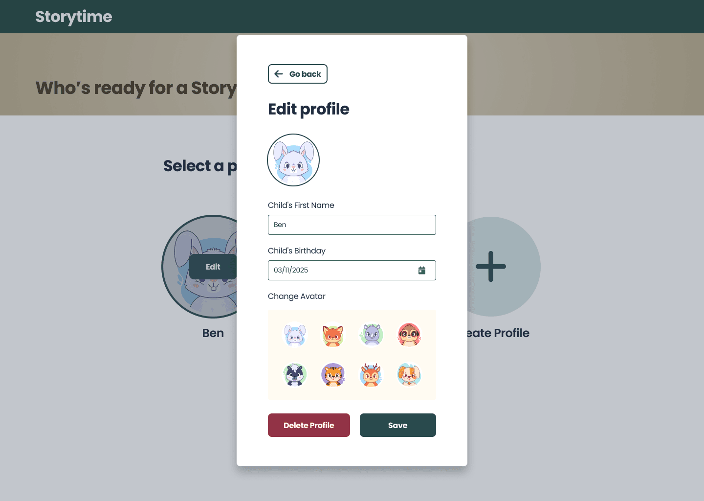
In the initial design of the kids' profile creation page, I included diverse human avatars representing different races and skin tones to promote inclusivity. While the PM initially appreciated the approach, he later raised a concern that it might unintentionally exclude or misrepresent underrepresented groups. Based on his feedback, I revised the design to feature animal avatars instead, offering a fun, neutral, and universally relatable option for all users.

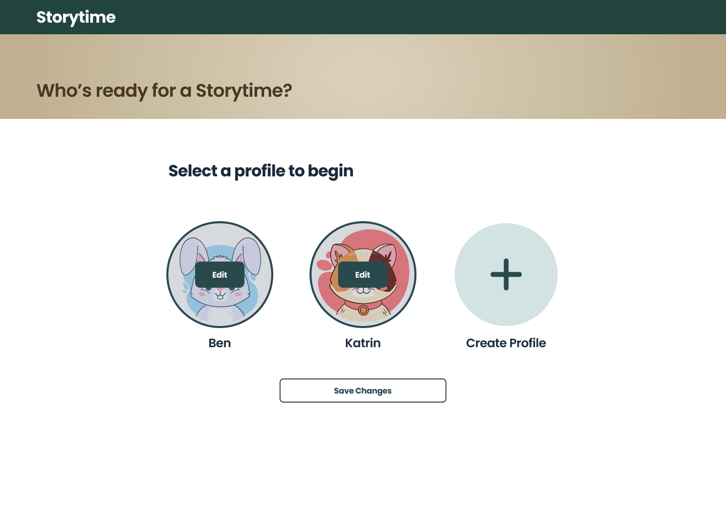
Identified Missing Requirement: Proposed Profile Management Feature
The story requirements initially didn’t include a profile management feature. I highlighted the need for users to edit their profiles, and as a result, the team added it to the list of user stories.
Improved the mobile layout through iterative feedback from the Product Manager
I initially designed the profile creation screen for mobile as a scrollable layout to accommodate multiple input fields in a clean, vertical flow. However, during the review, the team suggested restructuring the layout to fit within a single viewport without scrolling, aiming for a more focused and compact user experience.
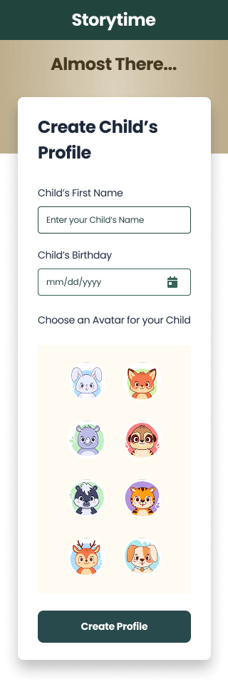
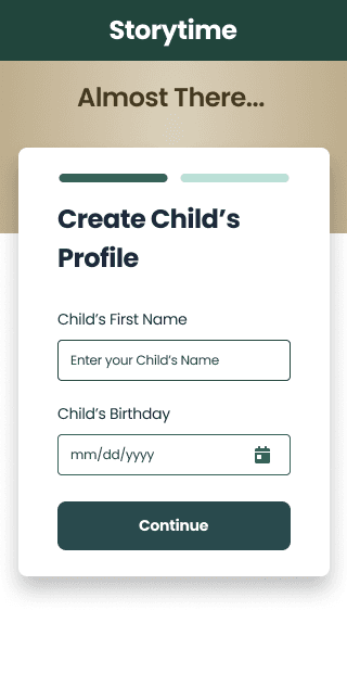
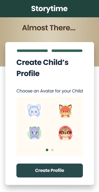
I restructured the layout into two distinct sections to ensure it fits within the fold, allowing users to see the CTA without scrolling. This approach also minimizes cognitive load by effectively chunking information.
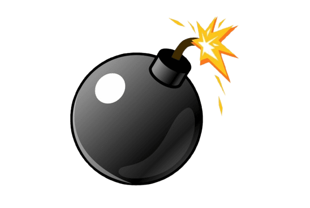
Here comes the UX Bomb!
After discussions with the PMs, I learned that a UI overhaul was planned due to new insights from Voice of Customer (VoC) feedback. The research revealed that children responded better to brighter colors and playful, kid-friendly themes, which helped them engage more comfortably with the interface. This approach also reassures parents by signaling that the app is a safe and welcoming space for their children.
Redesigning the Experience: A Fresh Take on the UI
Based on the new insights from VoC feedback, I led a UI revamp to better align with user expectations. Given the tight two-week timeline leading up to Demo Day, we pivoted our strategy and focused solely on building a mobile MVP to ensure we met the deadline.
The PM collaborated with me during the brainstorming and wireframing process, providing a skeletal layout of the new interface to guide the design direction.
Refining the interface with better usability practices
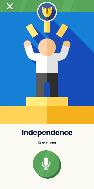
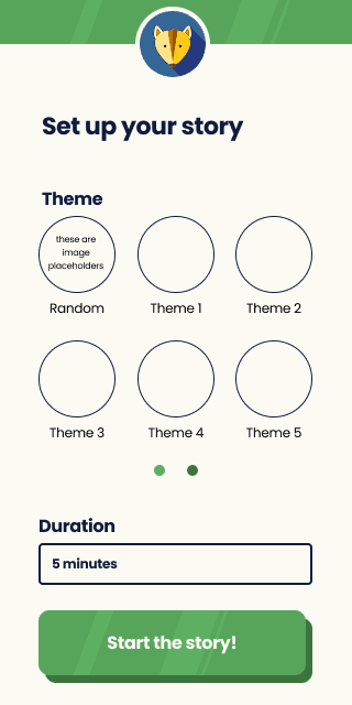
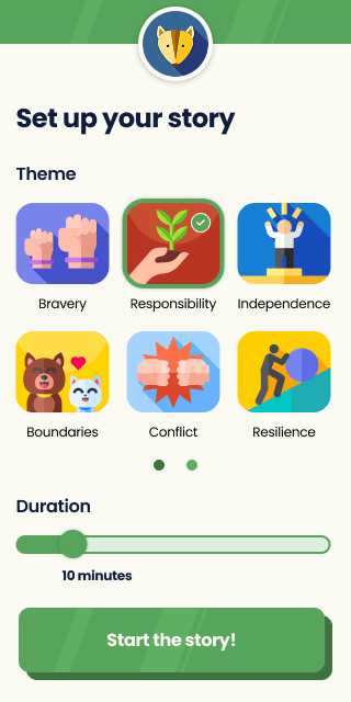
Story selection screen had 12 circular theme options across two pages, along with a dropdown for selecting story duration.
I replaced the dropdown with a slider for a more convenient and user-friendly interaction. Additionally, I changed the theme selection shape to squares to visually distinguish them from the circular avatar options.
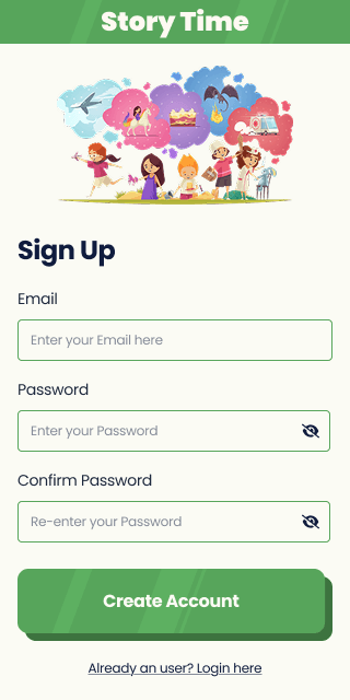
For the signup/login page, the initial sketch included form fields with only placeholders and no visible labels. I pointed out a usability issue that, what if a user forgets the purpose of a field while typing, they’d have to click out of it to recall the placeholder text, creating unnecessary friction. To improve the experience, I recommended and added persistent labels to each field.

Understanding the limitations of AI functionality.
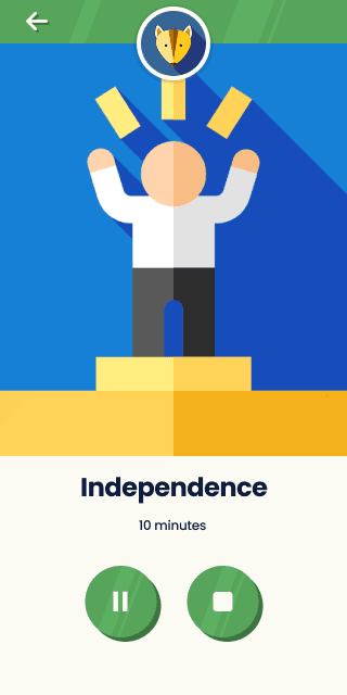
I initially considered adding a progress bar to indicate the length of a story session. However, the PM explained that due to technical constraints, the AI models couldn't reliably predict session duration. As a workaround, the team decided to timebox the sessions to approximate timing. Given this limitation, I was advised not to include a progress bar in the MVP.
Solving the placement of buttons
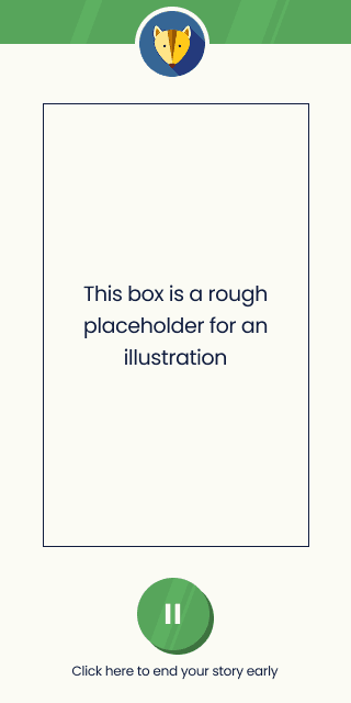
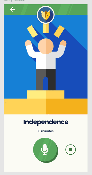
The PMs requested that I replace the pause and stop buttons with a single microphone button to simplify the interaction. In the next iteration, I introduced a prominent microphone button along with a smaller stop button. However, the PMs were concerned that children might accidentally tap the stop button, which could disrupt their experience. They asked me to explore alternative solutions. After brainstorming layout ideas and drawing inspiration from Duolingo for Kids, I replaced the back button with an ‘X’ icon and implemented a confirmation popup to prevent accidental exits, improving both usability and child-friendliness.
Further refinements made after first round of usability testing
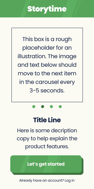
During the testing phase, I observed that returning users were mistakenly clicking the 'Let’s Get Started' button—intended for sign-up—instead of the smaller login link below. This led to unnecessary friction as users had to backtrack to access the login option. To address this, I redesigned the layout by introducing two clearly labeled buttons—'Sign Up' and 'Login' as secondary actions, reducing confusion and streamlining the user flow.

Outcomes & Results
We successfully delivered working MVP product within two months despite having an UI overhaul. The product was well-received by stakeholders, aligned with user and business goals.
Accomplishment
This project taught me how to navigate ambiguity, collaborate cross-functionally, and deliver high-quality work under tight deadlines—all while keeping user needs at the center of every decision.
Huge shoutout to the Storytime team and the AI PM Bootcamp for this unforgettable opportunity.

Introduction
AugierAI.com is a comprehensive AI-powered platform that supports small to mid-sized businesses throughout the entire procurement lifecycle, from identifying opportunities to teaming and project management. I joined this startup project as a UX Design Intern during the final semester of my Master's program. Working in a fast-paced environment during the platform's initial development phase provided me with valuable learning experiences. I contributed significantly to the project's success by designing user-centered and business oriented solutions to streamline workflows. I am sharing a small portion of the project I worked on, which is now live, in this case study.
Introduction
Challenges and Key Learnings
Balancing tight deadlines with a complete UI overhaul was a challenging experience that exposed me to the ambiguity and fast-paced decision-making often found in real-world projects.
Understanding the technical constraints of AI was a valuable learning experience that helped me design more effectively using best practices tailored for AI-driven products.
View other Case Studies