Home

Startup Project
Duration: 2 Months
Figma
AugierAI.com is a comprehensive AI-powered platform that supports small to mid-sized businesses throughout the entire procurement lifecycle, from identifying opportunities to teaming and project management. I joined this startup project as a UX Design Intern during the final semester of my Master's program. Working in a fast-paced environment during the platform's initial development phase provided me with valuable learning experiences. I contributed significantly to the project's success by designing user-centered and business oriented solutions to streamline workflows. I am sharing a small portion of the project I worked on, which is now live, in this case study.
Introduction
Project Overview
Osaz skincare project is redefining how skincare intelligence is built and delivered by blending advanced AI with diverse, high-quality datasets to power personalization and inclusivity in beauty. In this project, I led the UX and product redesign of the onboarding flow, focusing on a key step: capturing user demographics for personalized skincare recommendations. We improved the user experience, aligned design with business goals, and grew subscriptions by 4x in under 60 days.
Problem Statement
The original survey was long, confusing, and disconnected from what the business actually needed to learn. The dashboard was data-heavy, but insight-poor. Users didn’t engage with it, and stakeholders couldn’t make informed decisions. The company was preparing for launch and needed validated feedback loops and real-time insights to drive conversions. Our goal: hit 1000+ subscriptions in 2 months.
Research & Discovery
User Research
Conducted 10 user interviews to understand friction points in the survey flow.
Analyzed 200+ prior survey responses using ChatGPT to extract top pain point themes.
Used Mixpanel to observe drop-off points and time-on-task for the dashboard
Stakeholder Alignment
Discussed with stakeholders to define business-critical KPIs.
Reframed survey goals to collect data that supported personalization and onboarding strategy
AI in Action
Used GPT to rewrite survey questions for clarity, tone, and bias reduction.
Applied clustering (via GPT + spreadsheet tools) on open-text responses to prioritize redesign elements.
Prototyped 3 dashboard variations using AI-generated layout suggestions via Galileo AI and Magician
AugierAI.com is a comprehensive AI-powered platform that supports small to mid-sized businesses throughout the entire procurement lifecycle, from identifying opportunities to teaming and project management. I joined this startup project as a UX Design Intern during the final semester of my Master's program. Working in a fast-paced environment during the platform's initial development phase provided me with valuable learning experiences. I contributed significantly to the project's success by designing user-centered and business oriented solutions to streamline workflows. I am sharing a small portion of the project I worked on, which is now live, in this case study.
Introduction
The Solution
Redesigned the onboarding experience to be frictionless and conversational, creating a friendlier, more delightful interaction that builds trust from the first tap.
Applied progressive disclosure to simplify the dashboard interface, reducing visual clutter and guiding users toward what matters most.
Strategically highlighted the subscription call-to-action to clearly communicate user value and drive higher conversion through focused design intent.
Design Journey
Design system setup
After gaining a clear understanding of the product we aimed to build, I began setting up the design system to ensure visual and functional consistency. I started with defining the color palette and typography, and progressively built reusable design tokens as I designed each screen based on the requirements. I built components for the design system for resuability.

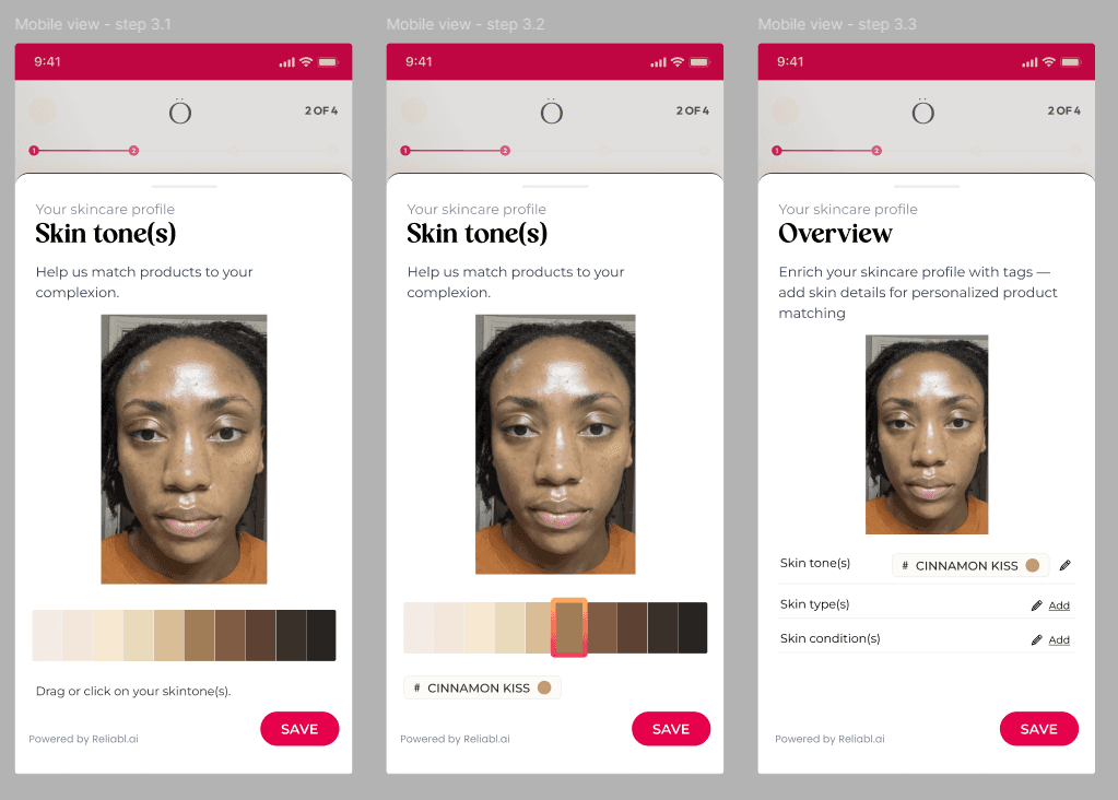
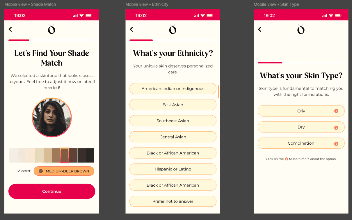
Making the Survey better
Initially I got the requirement to just redesign the survey to make it look better. The stakeholders didn't have the proper vision to prioritize the business goals. I brought the discussion to the table to define the business goals so it will shape the redesign. After the discussion, I got the updated brief to achieve the goal of gaining 1000+ subscriptions in 2 months. Based on the business and user goals, I took the help of AI tools to streamline the design process with faster ideation and usability testing.
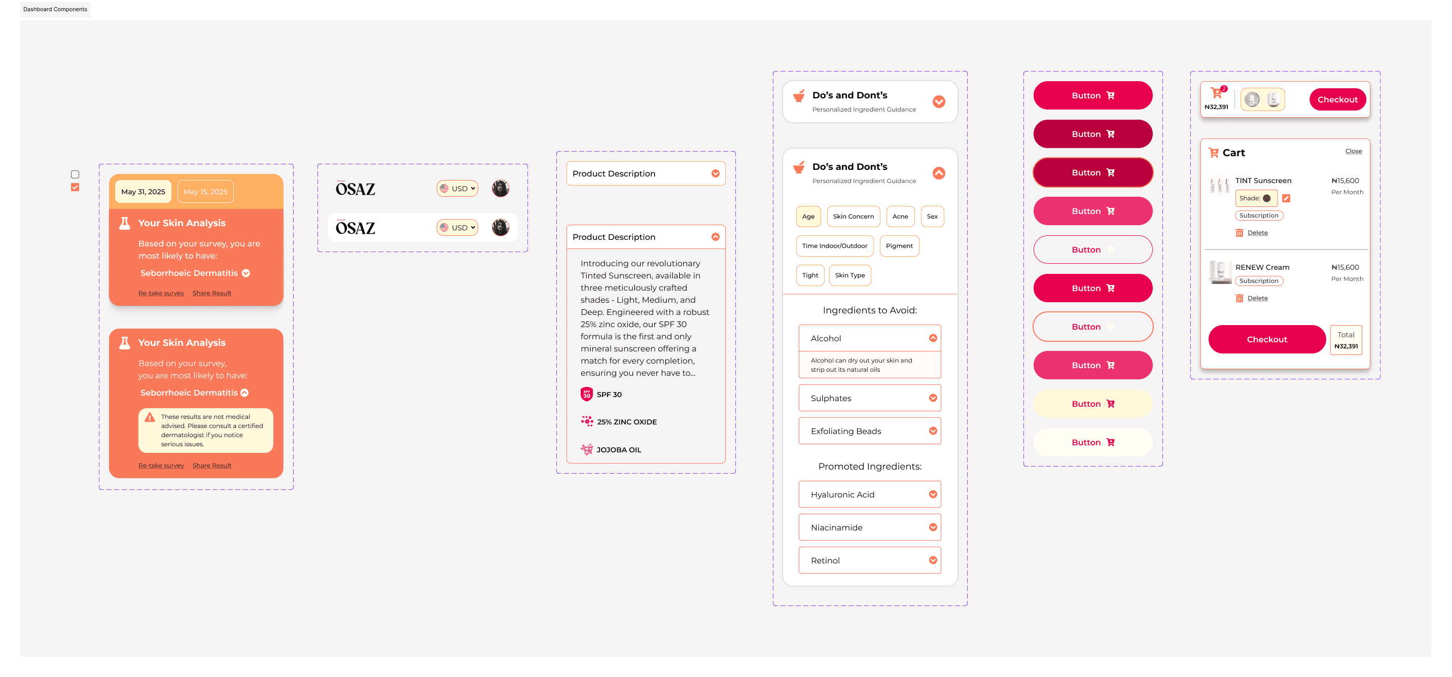
Making the Dashboard better
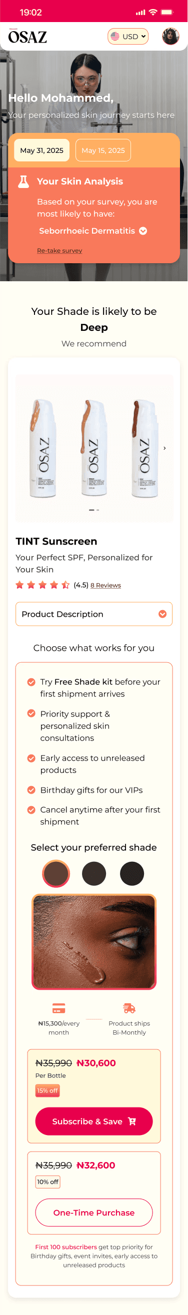
Redesigning the dashboard required multiple iterations as shown below to arrive at the final version. Each iteration aimed to improve the user experience while also strategically highlighting the subscription option to encourage conversions.
With updated requirements, I used iconography to clearly communicate key details about the sample pack and introduced a two-panel layout to present different purchase options. However, I later recognized that this approach leaned toward dark UX patterns. In the third iteration, I revised the design to make the one-time purchase option more visible and accessible, ensuring a more transparent and user-friendly experience.
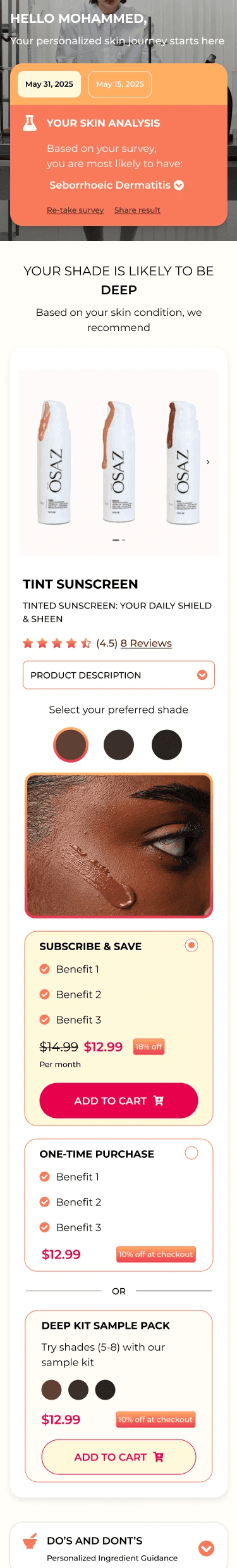
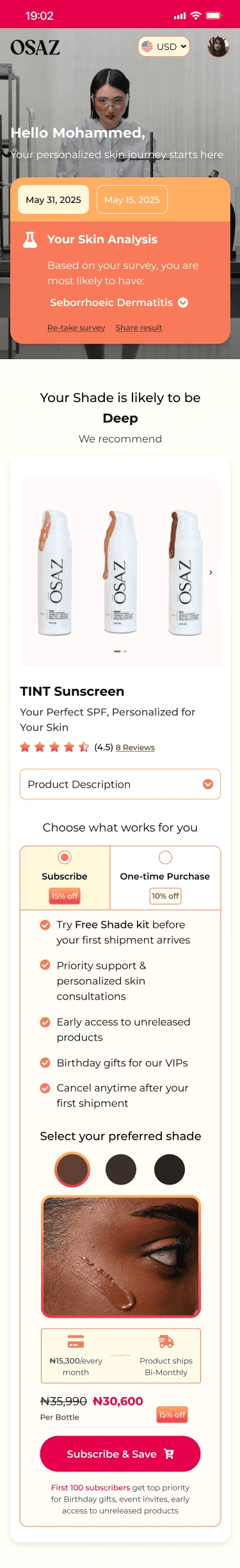
Best Iteration of Dashboard
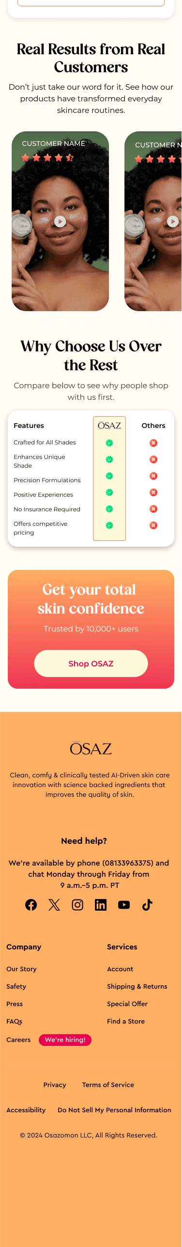
The final iteration of the dashboard was thoughtfully designed to highlight key insights about the user’s skin condition based on their survey responses. It follows a strategic business flow: first presenting the problem, then offering a tailored solution. To support this, I placed the company’s best-selling product immediately after the skin analysis as the recommended solution.
Following the sunscreen recommendation, the rest of the dashboard continues the sales journey by showcasing additional products through personalized ingredient suggestions, usage tips, customer reviews, and a clear final call-to-action.

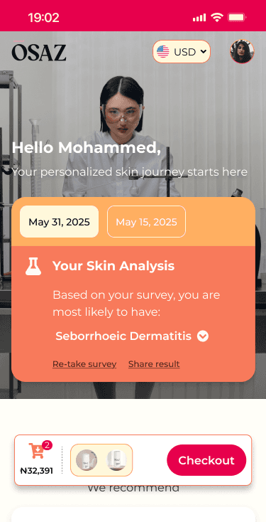
Strategic placement of Cart Section
The floating cart is strategically placed at the bottom center to ensure high visibility without interfering with the main content. Positioned within the natural thumb zone, it offers easy access for mobile users, encouraging smooth navigation and reducing friction during checkout. Its placement directly follows the skin analysis result, supporting a seamless flow from diagnosis to solution and prompting purchase intent at the right moment.
With a clear product preview, item count, and total price, the cart builds trust and transparency. The bold “Checkout” button and clean design make it stand out without feeling intrusive, reinforcing the business goal of driving conversions while maintaining a user-friendly, mobile-optimized experience.
Responsive layout
Designed and implemented responsive layouts for both desktop and tablet screens, ensuring a seamless and consistent user experience across devices. Special attention was given to optimizing image upload, AI prediction results, and interactive components for medium and large screen sizes. This improved usability for users accessing the platform from non-mobile environments, such as clinics, consultation booths, or at-home desktop setups, while maintaining visual clarity and functional consistency with the mobile-first design.
AugierAI.com is a comprehensive AI-powered platform that supports small to mid-sized businesses throughout the entire procurement lifecycle, from identifying opportunities to teaming and project management. I joined this startup project as a UX Design Intern during the final semester of my Master's program. Working in a fast-paced environment during the platform's initial development phase provided me with valuable learning experiences. I contributed significantly to the project's success by designing user-centered and business oriented solutions to streamline workflows. I am sharing a small portion of the project I worked on, which is now live, in this case study.
Introduction
Key Learnings and Action items
Working on a fast-paced startup project, I wore multiple hats such as Product Manager, UI/UX Designer, and Product Strategist. This multidisciplinary role allowed me to deeply engage with both the design and business sides of the product. I focused on aligning design decisions with core business goals, ensuring the team stayed on track while remaining flexible to iterate rapidly. This approach helped us refine the product through continuous feedback and improvements, ultimately driving it in the right direction.
I plan to leverage AI tools to accelerate usability testing, identify design issues early, and iterate quickly based on user feedback. I view design as an ongoing, iterative process—and I genuinely enjoy refining and improving the product through continuous learning. Once the design was finalized, I ensured a smooth handoff to developers by providing clear documentation and assets. I remain actively involved in development to ensure the final product aligns closely with the intended user experience.
View other Case Studies