Home

Design Challenge
Duration: 2 Days
Figma
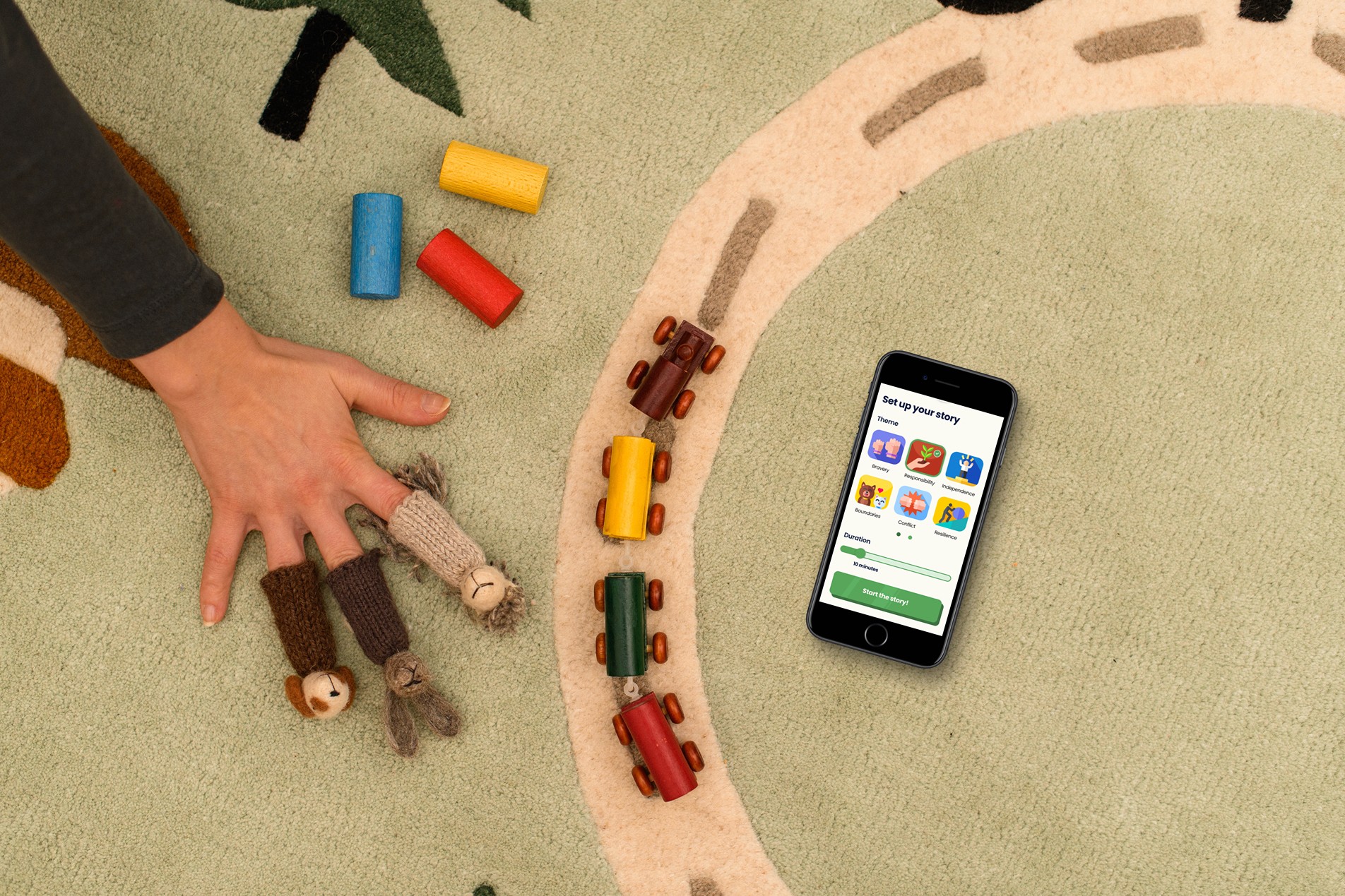
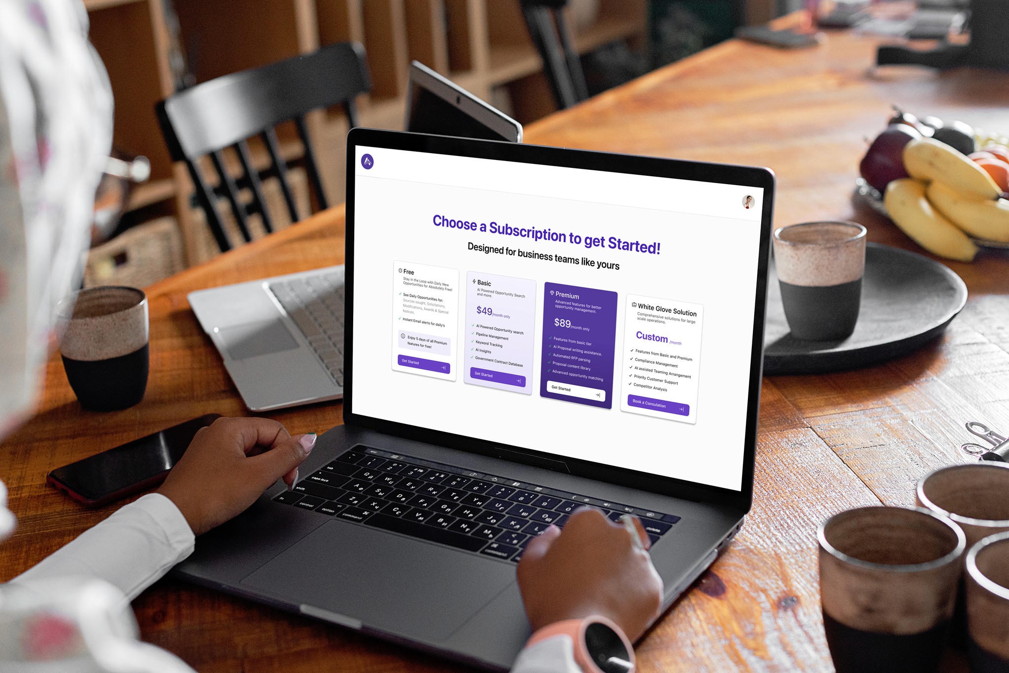
AugierAI.com is a comprehensive AI-powered platform that supports small to mid-sized businesses throughout the entire procurement lifecycle, from identifying opportunities to teaming and project management. I joined this startup project as a UX Design Intern during the final semester of my Master's program. Working in a fast-paced environment during the platform's initial development phase provided me with valuable learning experiences. I contributed significantly to the project's success by designing user-centered and business oriented solutions to streamline workflows. I am sharing a small portion of the project I worked on, which is now live, in this case study.
Introduction
Case study Overview
This case study showcases a design challenge I completed as part of an interview process for a startup company. The hiring team appreciated my submission and invited me for an interview, which went well. Although I ultimately did not secure the role, I’m proud of the work I produced and chose to include it in my portfolio.
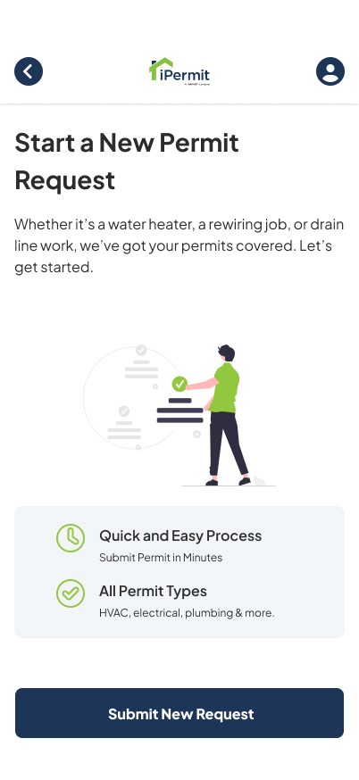
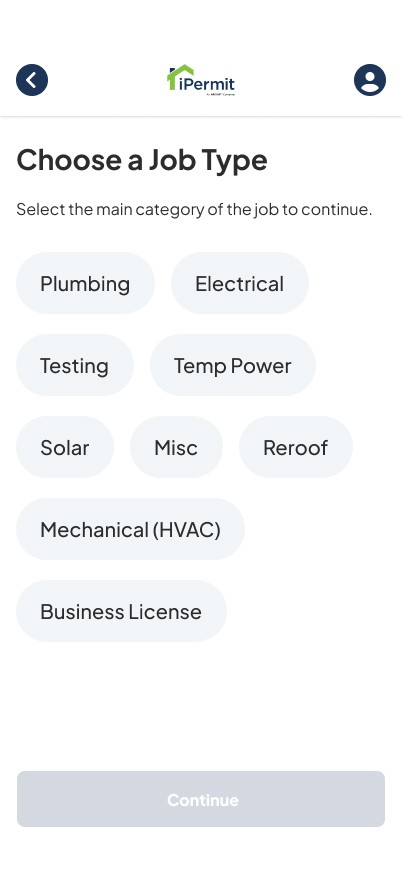
The challenge involved redesigning the UI/UX of a legacy web application called iPermit Pro, primarily used for submitting permit requests. Since the role I applied for was focused on Mobile UI/UX Design, I chose to streamline the user experience specifically for mobile devices. My approach emphasized progressive disclosure to prevent users from feeling overwhelmed by too much information at once—resulting in a cleaner, more intuitive experience.
Problem Statement
Contractors working on residential construction projects often need permits for tasks such as installing AC units, plumbing, or electrical equipment. To obtain these permits, they use a platform called iPermit Pro—a contractor portal where they submit project details and the service handles the permitting process on their behalf.
However, the current experience of submitting requests through iPermit Pro is outdated, unintuitive, and not optimized for mobile use—causing delays, confusion, and friction in an otherwise straightforward task. There is a critical need to redesign the platform to streamline the submission process, reduce cognitive load, and support on-the-go permit applications via mobile.
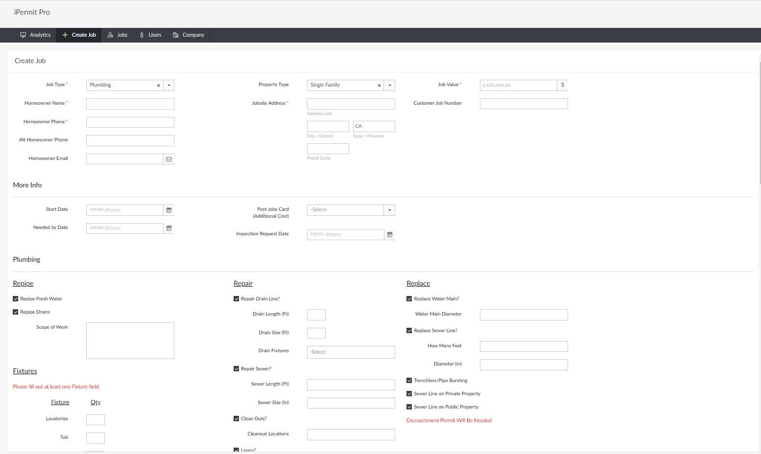
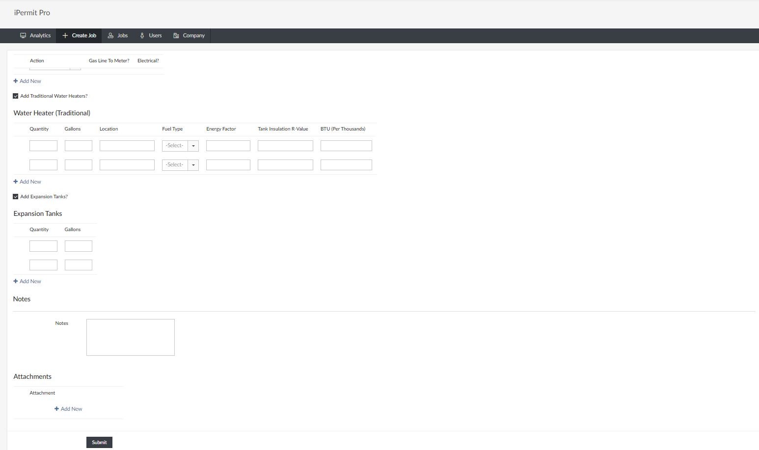
Old design
The problem with the original design was the overwhelming amount of information presented upfront, which created significant cognitive load and hindered the user experience. To address this, I reimagined the interface to prioritize clarity and simplicity. I also incorporated the brand’s color palette more strategically to create a visually balanced and user-friendly design.
AugierAI.com is a comprehensive AI-powered platform that supports small to mid-sized businesses throughout the entire procurement lifecycle, from identifying opportunities to teaming and project management. I joined this startup project as a UX Design Intern during the final semester of my Master's program. Working in a fast-paced environment during the platform's initial development phase provided me with valuable learning experiences. I contributed significantly to the project's success by designing user-centered and business oriented solutions to streamline workflows. I am sharing a small portion of the project I worked on, which is now live, in this case study.
My Approach towards the redesign
Understanding the Information to create better IA
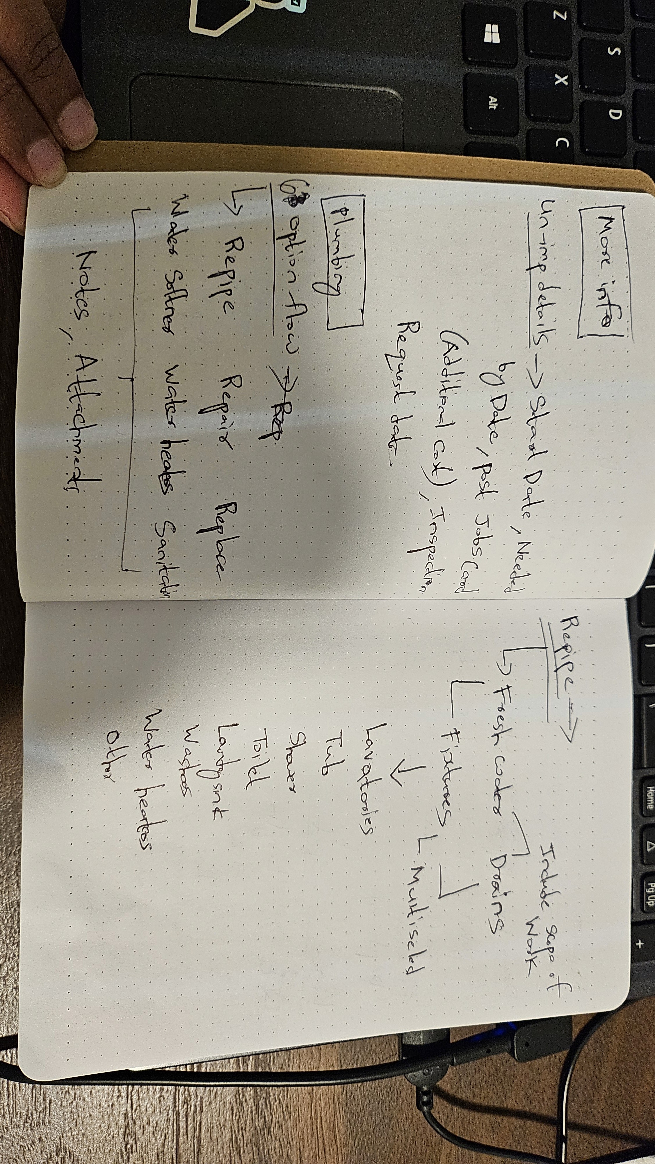
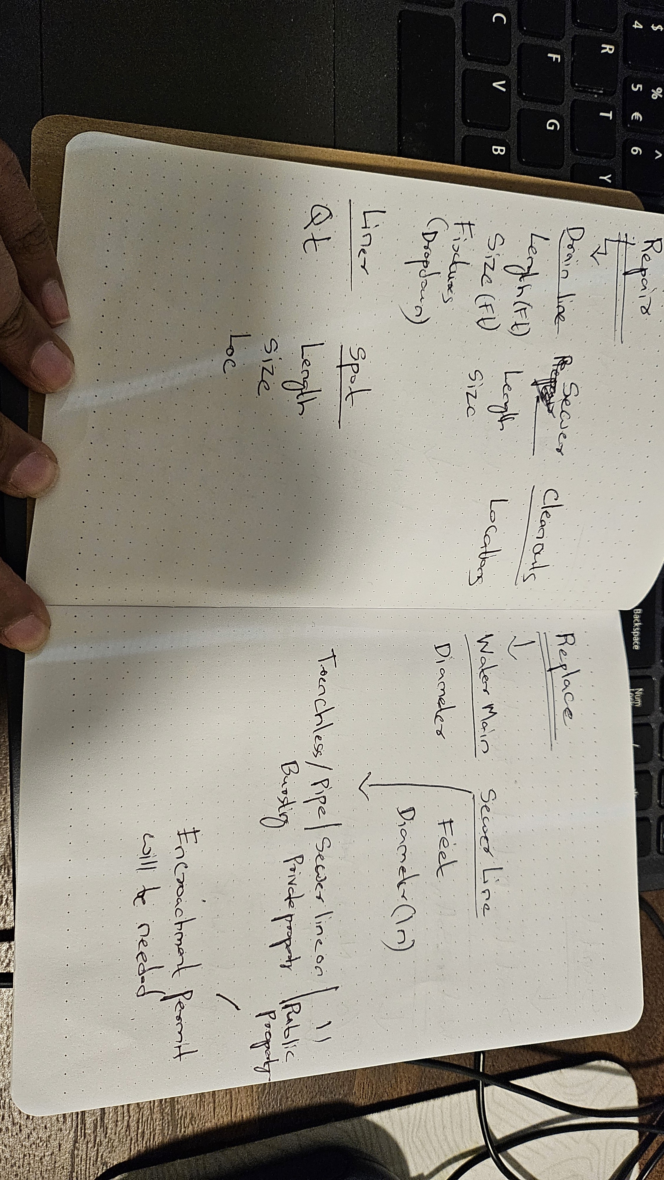
Before diving into visual design, I took time to thoroughly understand the existing system and identify areas for improvement in the information architecture. Using pen and paper, I mapped out the structure and flow of information to ensure a more intuitive user experience.
This step in my design process reflects my commitment to thoughtful planning—I don’t jump straight into high-fidelity tools like Figma. Instead, I prioritize understanding the problem, defining user needs, and outlining clear solutions before moving into design execution.
Defining the color palette
I reviewed the iPermit website to identify the existing color scheme and incorporated those colors into the design system within my Figma file. This ensured that my wireframes aligned with the company’s current visual identity, making the redesign feel authentic and consistent. I also took the initiative to research the company’s design language and brand to demonstrate my attention to detail and genuine interest—hoping to make a strong impression on the hiring managers.

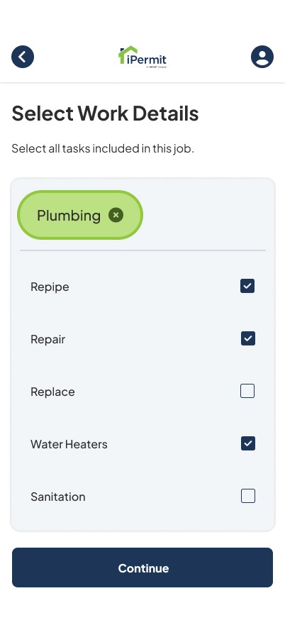
Improved Usability with better input fields
To improve usability on mobile, I chose chips over dropdowns. Dropdowns require extra taps, scrolling, and often hide options in limited screen space. Chips display all options upfront, are easier to tap, and support quicker decisions. They follow familiar mobile patterns, making the interface more intuitive and user-friendly.
Old Design

New Design
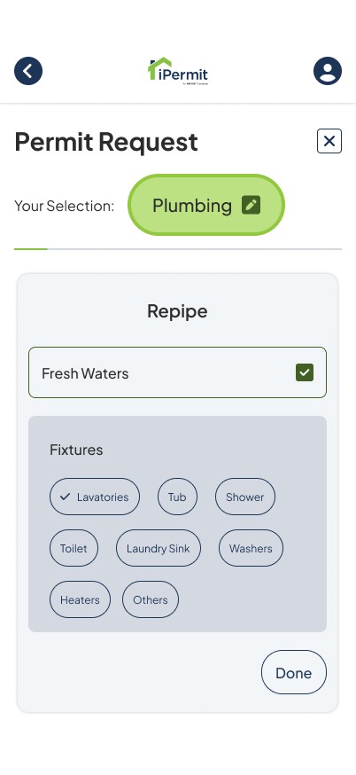
Guiding users with progress Indicators
The previous design lacked structure, presenting options in a scattered layout that often left users feeling overwhelmed. Additionally, the absence of progress indicators made it difficult for users to understand where they were in their journey. I’ve addressed these issues by introducing clear progress indicators for both the overall journey and individual subtasks, enhancing orientation and usability.
New Design
High-Fidelity Prototype
You can view all screens made for the entire flow. Please note that I am using Figma free version currently so it limits the usage of variables in prototyping.
AugierAI.com is a comprehensive AI-powered platform that supports small to mid-sized businesses throughout the entire procurement lifecycle, from identifying opportunities to teaming and project management. I joined this startup project as a UX Design Intern during the final semester of my Master's program. Working in a fast-paced environment during the platform's initial development phase provided me with valuable learning experiences. I contributed significantly to the project's success by designing user-centered and business oriented solutions to streamline workflows. I am sharing a small portion of the project I worked on, which is now live, in this case study.
Learnings & Reflections
I’ve gained valuable experience in simplifying complex enterprise web applications by applying progressive disclosure techniques to enhance usability and reduce cognitive load.
I significantly enhanced the visual design by strategically applying brand colors using the 60-30-10 rule to achieve balanced and visually appealing compositions.
While the project was relatively small in scope, it played a key role in sharpening my design thinking and enhancing my visual UI design skills.
Introduction
View other Case Studies